TailwindCSS’s default light and dark theme setup works well for simple projects. But when you’re building sites for multiple brands or need more than two themes, you’ll quickly hit limitations. For a recent client project, I had to go beyond light and dark themes, designing custom themes for different brand identities. For instance, I created one theme with a red palette for one brand and a green palette for another.
If you're only interested in a light/dark theme, this approach might be overkill. But for projects requiring more flexibility—whether it’s for brand identity, accessibility features, or seasonal designs—this setup can be incredibly powerful.
Default way of handling themes in TailwindCSS
By default, TailwindCSS provides a simple dark: prefix for specifying dark theme related styling. However, when working with multiple brand-specific themes, the default setup becomes limiting. As the default setup only allows for two different themes:
<button class="bg-white dark:bg-black">Click me</button>Handling multiple themes
In order to handle multiple themes, we need to create a setup that allows us to configure and manage different themes. We can do this by extending the default TailwindCSS configuration and leveraging CSS variables.
Step 1: Create theme configuration
Begin by creating a theme configuration file. This file will define the colors for each theme, using component-specific design tokens:
// themes.css
@layer base {
    :root,
    .brand-X {
        --color-button-primary: 234 67 53; /* Red */
        --color-button-secondary: 255 204 203; /* Light Red */
    }

    .brand-Y {
        --color-button-primary: 67 160 71; /* Green */
        --color-button-secondary: 102 187 106; /* Light Green */
    }
}
Note that the values we define are in RGB format without the
rgb()function. This is because we will use these values in thergb()function in the TailwindCSS configuration file later on.
By using CSS variables alongside component-specific design tokens, we create a flexible system that makes it easy to swap colors and other styling properties across themes without changing the underlying HTML or CSS structure.
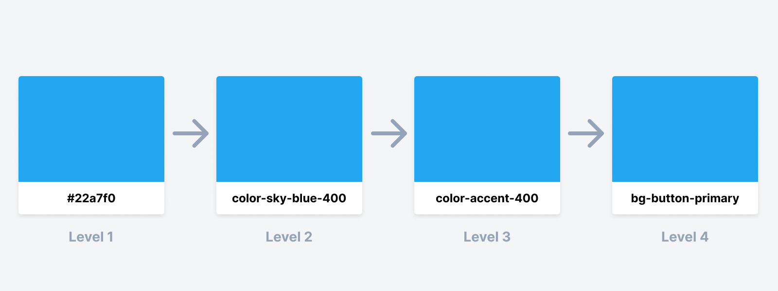
Design tokens allow for organized adjustments to the color scheme, ensuring consistency across components while minimizing disruption to the overall design. This approach follows a hierarchical structure of design tokens:
- Level 1 tokens: Core values not tied to any specific use case.
- Level 2 tokens: Reference tokens, human-readable, like blue-500.
- Level 3 tokens: Application-specific tokens, often indicating use cases like accent-color-900.
- Level 4 tokens: Component-specific tokens used to style components directly, such as button-primary.

Step 2: Extend the TailwindCSS configuration
Next, extend the TailwindCSS configuration to use the colors defined earlier in the themes.css file. Ensure that the file is properly imported into your project, as the CSS variables won’t be recognized otherwise. Use the rgb() function to reference these CSS variables:
// tailwind.config.ts
const config = {
    content: ['./src/pages/**/*.{js,ts,jsx,tsx,mdx}', './src/**/*.{js,ts,jsx,tsx,mdx}'],
    darkMode: 'selector',
    theme: {
        extend: {
            colors: {
                button: {
                    primary: 'rgb(var(--color-button-primary) / <alpha-value>)',
                    secondary: 'rgb(var(--color-button-secondary) / <alpha-value>)'
                }
            }
        }
    },
    safelist: [],
    plugins: []
};
export default config;
Here, darkMode is set to 'selector', allowing us to manually control theme switching based on the class name applied to the body or another element, instead of relying on user preference or system settings. Additionally, the special <alpha-value> placeholder is used to inject the alpha value when using an opacity modifier, allowing you to use the default TailwindCSS opacity classes like bg-button-primary/80 for an 80% opacity.
Changing the theme
Switching between themes is simply achieved by modifying the class name of the <body> element. This simple approach allows the application to switch between themes without the need for complex logic:
// Branding X (Red)
<body class="brand-X">
    <button class="bg-button-primary">Click me</button>
</body>

// Branding Y (Green)
<body class="brand-Y">
    <button class="bg-button-primary">Click me</button>
</body>
For a better user experience, consider implementing a theme switcher component that enables users to choose their preferred theme.
Conclusion
Managing multiple themes in TailwindCSS is achievable by extending the default configuration and leveraging CSS variables along with design tokens. This approach not only supports multiple brand-specific themes but can easily be adapted for various scenarios—whether it’s providing accessibility options like high-contrast themes or creating seasonal designs for special occasions like holidays.
While the default light/dark setup might be sufficient for simpler projects, this method offers the flexibility to scale and customize your design system in a single place as the project evolves, allowing you to add new themes or adjust existing ones with minimal effort.